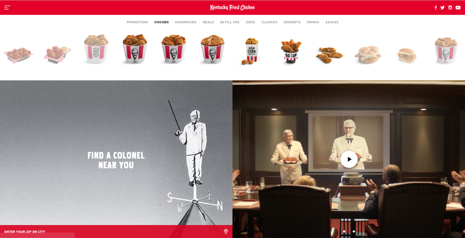
Folks, it's that rare occasion where I post about a website that won't annoy you. kfc.com won't annoy you because it has a simple, pleasant layout that should easily guide you to whatever you're looking for on the site. Here's why kfc.com won't annoy you:
- A clean layout, with the most important information displayed prominently. The four main sections – title bar, menu, location finder, and video of latest commercial – take up the entire page.
- Sleek title bar, with just the company name, minimalist logos of links to KFC's social media pages, and an icon linking to more detailed site information.
- The page takes up the entire screen - unlike many other sites that are not formatted for widescreen displays and have wide, empty side margins.
- Nice red motif found in each section of the website.
The website format is simple and elegant. Good ol' Colonel Sanders does pop up about a half a dozen times on the page, which could lead to nightmares if all-white-clad elderly men carrying platters of chicken frightens you... but at least you won't be annoyed!
I like the layout to your blog, I went super basic with it but you did a good job with yours. I also enjoy some KFC from time to time.
ReplyDeleteI like the layout to your blog, I went super basic with it but you did a good job with yours. I also enjoy some KFC from time to time.
ReplyDelete