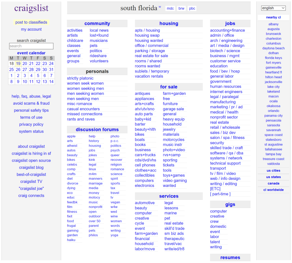
It is tough to even say that craigslist.org has a design. It's just a list of links formatted in columns. Craigslist is online classifieds website that allows users to making postings in a wide range of categories. Apparently, craigslist.org has not changed its design since its inception in 1995. Presumably, Craigslist's owners think this "retro" feel of the site suggests that the website is a good, reliable site that has been around a long time. Even if you're a lover of all things nostalgia, craigslist.org will annoy you for the following reasons:
- It looks more like a Word document than a website.
- The search bar – arguably the most important feature for a classifieds website – is very small. The heading, "search craigslist" is not even bolded, whereas all the other headings are.
- Any time you meet up with a stranger you met online, you are opening yourself to potential harm. Craigslist could easily mitigate this risk with an eBay-style user feedback system or by verifying personal information about users. Not convinced? Check out "5 Craigslist crimes that will creep you out".
- Craigslist is plagued by chronic re-postings. Since all listings are ordered by date, users often re-post their listing to make it appear at the top. Although Craigslist will automatically block an identical re-post, tweaking the posting slightly allows it to get through. This is another big problem that Craigslist could easily fix by keeping better track of its users.
According to Alexa, craigslist.org is the 13th most popular website in the United States. There's no good reason that such a popular website should be so poorly designed. Annoying, right?
I agree with you that Craigslist lacks a design aspect at all. I do think the information is organized well because almost anyone can use it, but I think they would really benefit from adding a layout and better navigation, maybe a top navigation bar that uses drop down lists to let you switch between areas easily.
ReplyDeleteI agree with you that Craigslist lacks a design aspect at all. I do think the information is organized well because almost anyone can use it, but I think they would really benefit from adding a layout and better navigation, maybe a top navigation bar that uses drop down lists to let you switch between areas easily.
ReplyDelete